3. Some Visual Composer's elements/functionalities are missing. How can I enable them?
***Note: Since the theme v1.2.0, the custom code for overriding Visual Composer are deprecated. You should now use most elements of Visual Composer in this version and later. There is no need to use the below instruction.
Some functionalities of VC have been intentionally limited/overridden to make the theme fit with the design. In case you would like to change that, you can find the related custom code in these files:
functions.php – This is the starting point of calling custom code.
/includes/plugin-codes/visual-composer/custom-vc.php – Custom code for VC.
/vc_templates – Custom template files for some VC elements.
/css/admin.css - Some CSS code related to VC interface on the backend.
4. How to create and show portfolio on the page?
Please find below for the summary of how to add portfolio into the page:
1. Go to "Portfolio > Add New Portfolio Item" to add each portfolio item. Repeat this until you get all the items you want.
2. Go to "Page > Add New" to add a page for listing all those created portfolio items.
3. In the page edit screen, click "Visual Composer" button to enable Visual Composer editor then click "Add element > Portfolio" to add the Portfolio element into the page. You can set some element options here, for examples, which portfolio categories to display, how many items, etc.
Note: I would also recommend to see the documentation for how to import the XML dummy data to get most posts/pages like showing on the demo and you can use them as examples. You can start from there or you might get some idea when browsing through the sample pages.
5. How to reorder portfolio categories on the listing template?
6. How to enable Visual Composer mode for portfolio item?
Please go to "Settings > Visual Composer" and tick the "uxbarn_portfolio" item in the Content Types list. Then the Visual Composer button will show up in the portfolio edit screen.
7. I got "Page Not Found" after changing pages on my portfolio. How to fix that?
Please make sure that the portfolio slug is not the same as any page slug.
For example, the theme by default uses "portfolio" as a portfolio slug. If you also have a page that has the same slug as "portfolio", please change the page slug to something else (eg. "my-portfolio").
OR, you might want to change the portfolio slug instead. To do that, go to "Appearance > Customize > Portfolio Options" and scroll down to the bottom. You will see the options to change portfolio slugs there.
After that, go to "Settings > Permalinks" and click save.
This should help.
8. Where to find the code of portfolio meta info (Date, Client, Categories and Website) so I can customize it?
***Note: Since the theme v1.2.0, a new feature for creating your own meta info for portfolio has been introduced. You can manage the custom meta info by going to "Settings > UXbarn Portfolio Options" and they will appear on the portfolio's edit screen. There is no need to use the below instruction.
There are two major sections involved which are:
1. For the front end, open "/uxb_templates/single-portfolio.php" file and there you will see the code for the meta info to display on your website.
2. For the back end, open "/includes/plugin-codes/custom-uxbarn-portfolio.php" file and search for the function of "uxbarn_custom_port_create_meta_info()".
9. Where to find the code of portfolio meta info (Date, Client, Categories and Website) so I can customize it?
*Note: Since the theme v1.5.0, a new feature for creating your own meta info for portfolio has been introduced. You can manage the custom meta info by going to "Settings > UXbarn Portfolio Options" and they will appear on the portfolio's edit screen. There is no need to use the below instruction.
There are two major sections involved which are:
1. For the front end, open "/uxb_templates/single-portfolio.php" file and there you will see the code for the meta info to display on your website.
2. For the back end, open "/includes/plugin-codes/custom-uxbarn-portfolio.php" file and search for the function of "uxbarn_custom_port_create_meta_info()".
10. How to reduce the top and bottom margins of the side panel?
Please go to "Style Customizer > Others > Custom CSS" and use this custom CSS:
P.S. In case you would like to use custom CSS for other elements, I would recommend "Developer Tools" on Chrome or "Firebug" on Firefox to inspect the elements on the page. Then you can know which CSS selector to adjust.
11. General troubleshooting steps
When there's something wrong happened with your WordPress site, don't panic. In many cases, the cause of issues can be found and solved easily. Please try the following troubleshooting steps:
First, make sure that everything is up-to-date on your site (WordPress, themes, and plugins).
If you still have issues, try to switch the theme to the default WordPress' Twenty [xxx] theme (for example, Twenty Seventeen) to make sure that the issues you are having are related to the UXBARN theme you are using. If the issues are still there after switching themes, it means the issues are not from the theme, but they might be from any of the plugins you are using.
Now you can try to disable the plugins one by one to see if any of them are the cause. If you find ones, please contact the plugin developers.
If the problem occurred after you had customized the theme, try to revert everything back to the default state. This should solve the problem in most of the cases. After that, double check your custom code again before adding it back piece by piece.
The above steps are probably enough for troubleshooting the issues by yourself.
But if you see an error message like "500 Internal Server Error", it means there's something wrong on your server. Please contact your system admin to help you check the server's error log and to solve the issue.
12. How to remove animation when hovering on blog images?
Please go to "Theme Options > Blog" and you will find an option to disable the effect.
13. How do I make the portfolio titles visible on the portfolio listing templates?
You can use custom CSS to adjust that. Please first make sure you are using the latest version of the theme, then go to "Appearance > Customize > Additional CSS" and you can apply this code to make the titles visible:
14. How to remove or hide the border around images?
You would have to edit the CSS for the ".border" class in "style.css" file to remove the border. Or, go to "Style Customizer > Others > Custom CSS" and try using the custom CSS as:
.border {
    border: 0 !important;
}
15. Is it possible to use an animated GIF as portfolio featured image? If yes, how?
It is possible, but you would need to override the parent theme’s function and customize it in a child theme.
17. How do I make the page content visible on portfolio templates?
The option for this was introduced in v1.0.2. If you are already using this version or above, please go to "Appearance > Customize > Portfolio Styles" and you will find the option named "Show Page Content?" in each template section.
18. How can I rename the "portfolio" slug and its texts to something else?
To rename that, please open "/includes/plugin-codes/custom-uxbarn-portfolio.php" file. You can then find the portfolio texts in the function of "uxbarn_custom_port_cpt_args()".
For the portfolio taxonomy, just see in the function of "uxbarn_custom_port_tax_args()".
If you get 404 page after making changes, please go to "Settings > Permalink" and click to save once. This should solve the 404 issue
19. How to adjust CSS for different screen sizes?
There are times when you wanted to use CSS code for different screen sizes. For example, you want to display the tagline normally on PC, but you want it to be hidden when viewing on a mobile.
*NOTE: Below instruction is for the theme version prior to v2.0.0. If you are using the theme v2.0.0 and above, you can just upload the image and it will be automatically scaled down to fit the area without hard cropping anymore. It means that the height of the slider will now be flexible depending on the uploaded image's proportion.
You can enter the code by going to “Apperance > Customize > Additional CSS”.
If you would also like to use custom CSS for other elements, we would recommend Developer Tools on Chrome or Firebug on Firefox to inspect the elements on the page. Then you will know which CSS selector to adjust.
Go to Appearance > Menus and click the Custom Links section. Enter "#" in the URL field and any character in the Link Text field.
Once it is added in the menus, add the "blank-menu" text in the CSS Classes field. If you do not see the field, click Screen Options at the top right of the screen and tick the checkbox to make it visible.
23. I've tried installing in WordPress but it says the theme is missing the style.css stylesheet. Am I doing something wrong?
The item is an HTML site template. It can't be used as a WordPress theme.
24. [v1.5.0 Note] Changes in theme's custom code for Visual Composer
Since the theme v1.5.0, most custom code for overriding Visual Composer's elements are deprecated. A little drawback is that it might affect some of previous elements that you are using in your theme. But it will be greater in a long run for supporting plugin's stability and its powerful features.
Some affected elements are:
Button
Previous one is deprecated.
Any icon that you were putting in the old button will not display.
Button shape (square, radius, and round) will not display correctly as it might only display as square shape.
Solution: Remove the old one and instead use the new Button element from the list.
Single Image
"on click" attribute of the element will be reset.
Solution: Edit the element and select the attribute again.
Image Gallery
Caption will not display.
You might need to respecify image size.
Note: You can use "circle" extra class name for making the gallery grid displaying as circular shape.
Call-to-action Box
Previous one is deprecated.
Text in the old box might disappear.
Solution: Remove the old one and instead use the new CTA element from the list.
You can enter either "bottom-line", "right-line", "left-line" or "top-line" into the extra class name field of the newer element to display the accent-color line on the box.
Progress Bar
Some bar colors might be missing which you can respecify.
Tabs
Previous one is deprecated. You can use a newer element from the list.
Tour
Previous one is deprecated. You can use a newer element from the list.
Message Box
You might have to reselect the color for the box.
Accordion & Toggle
Previous one is deprecated. You can use a newer element from the list.
You might have to respecify the active tab and collapsible attribute.
25. How do I disable the lightbox on portfolio single pages?
Please go to "Appearance > Customize > Portfolio Options" and scroll to the "Other Options" section. You will find the option to disable it there. ;)
26. How do I expand the width of the content area?
Please go to "Appearance > Customize > Additional CSS" and apply all the custom CSS below:
28. How to manage and use custom meta info for portfolio?
To manage the custom meta info list, please go to "Settings > UXbarn Portfolio Options" then select "Custom Meta Info" tab. After saving, they will appear on the portfolio's edit screen then you can enter the data.
29. How to make the page/post content area wider?
You would have to manually use custom CSS to adjust that. Please go to "Appearance > Customize > Additional CSS" and try applying this code:
30. OptionTree could not be downloaded and installed. What to do?
On November 6, 2018, the OptionTree plugin seemed to be somehow disabled on the plugin repository of WordPress.org so you would not be able to download and install it. When you are trying to install the plugin, you might get an error message like this:
Something went wrong with the plugin API.
The issue should be temporary, and it should be online again in a few days.
However, if you are still experiencing the issue, you can manually install the plugin by following these steps:
2. On your WP admin panel, go to \"Plugins > Add New > Upload Plugin\" then browse to the plugin\'s ZIP file you downloaded in step 1 and click the Install Now button.
3. After it is installed, click the Activate Plugin button you see on screen.
* The themes that are affected by this situation are: Kathy, Darren, Alvar, Enso, Viceversa, Nakamura, Finnik, Lowel, Schon, Calmer, Thine, Kose, Fineliner, and Archtek.
Latest Update about OptionTree (April 3, 2019)
The author of OptionTree has already updated the plugin to v2.7.0, but it is currently in a develop branch on their github repo (reference: https://github.com/valendesigns/option-tree/issues/696#issuecomment-476055302 ). Once everything is settled, we will update and include the latest version of OptionTree in the following themes:
Lowel, Schon, Calmer, Thine, Kose, Fineliner, and Archtek
Note that for the other themes (Kathy, Darren, Alvar, Enso, Viceversa, Nakamura, and Finnik), the OptionTree plugin has been replaced with Advanced Custom Fields.
31. Is it possible to remove left and right white space around the top page/post image?
The white space is part of the design, but if you want to remove that, you can use this custom CSS as a workaround.
*NOTE: Below instruction is for the theme version prior to v2.0.0. If you are using the theme v2.0.0 and above, you can just upload the blog image (featured image) and it will be automatically scaled down to fit the area without hard cropping anymore. It means that the height of the image will now be flexible depending on the uploaded image's proportion.
34. Where to find the code of portfolio meta info (Date, Client, Categories and Website) so I can customize it?
In the latest version of the theme, you can customize the portfolio's meta info by going to "Settings > UXbarn Portfolio Options > Custom Meta Info". There you can create your own set to use in the theme instead of the default ones.
35. [v1.8.0 Note] Changes in theme's custom code for Visual Composer
Since the theme v1.8.0, most custom code for overriding Visual Composer's elements are deprecated. A little drawback is that it might affect some of previous elements that you are using in your theme. But it will be greater in a long run for supporting plugin's stability and its powerful features.
Some affected elements are:
Button
Previous one is deprecated.
Any icon that you were putting in the old button will not display.
Button shape (square, radius, and round) will not display correctly as it might only display as square shape.
Solution: Remove the old one and instead use the new Button element from the list.
Single Image
"on click" attribute of the element will be reset.
Solution: Edit the element and select the attribute again.
Note: You can use "border" extra class name for displaying border around image.
Image Gallery
Caption will not display.
You might need to respecify image size.
Note: You can use "circle" extra class name for making the gallery grid displaying as circular shape.
Call-to-action Box
Previous one is deprecated.
Text in the old box might disappear.
Solution: Remove the old one and instead use the new CTA element from the list.
You can enter either "bottom-line", "right-line", "left-line" or "top-line" into the extra class name field of the newer element to display the accent-color line on the box.
You can enter "header-has-line" into the extra class name field of the newer element to display the line under the CTA title.
Progress Bar
Some bar colors might be missing which you can respecify.
Tabs
Previous one is deprecated. You can use a newer element from the list.
Tour
Previous one is deprecated. You can use a newer element from the list.
Message Box
You might have to reselect the color for the box.
Accordion & Toggle
Previous one is deprecated. You can use a newer element from the list.
You might have to respecify the active tab and collapsible attribute.
36. Creating a child theme
This article is offered for informational purposes. Please note that while we're happy to provide this guide, we can't offer support for custom code modifications. For details on what our support covers, please review our Item Support Policy.
Before you proceed, it's crucial to understand the steps outlined in this article.
Firstly, ensure your theme is updated to the latest version.
If you're planning to make more than just CSS changes to the theme, we highly recommend using a child theme. A child theme allows you to modify the parent theme's functions, templates, and styles without losing those changes when you update.
For these tasks, you can use an FTP client like FileZilla to connect to the server hosting your WordPress site.
Ready to create a child theme? Follow the steps below:
1. Create a New Folder: Start by creating a new folder for your child theme within the "themes" directory of your WordPress site. The directory path should look something like this:
[root]/wp-content/themes/
For this example, we'll name the child theme's folder "child-theme," making the complete path look like:
[root]/wp-content/themes/child-theme/
2. Add Required Files: Inside the "child-theme" folder, create two essential files: "style.css" and "functions.php."
3. Edit 'style.css': Open the "style.css" file in your child theme and insert the following code at the top:
The crucial part here is the "Template" line. This must match the folder name of the parent theme. For instance, if you're using our Kathy theme as the parent, the "Template" line should read "kathy," like so:
/*
 ...
 Template:     kathy
 ...
*/
Note: If you're using a different theme, adjust this line accordingly.
4. Edit 'functions.php': Now, open the "functions.php" file in your child theme and add the following code at the top:
This action and function instruct WordPress to load the "style.css" file of the child theme, appending it to the parent theme's list of styles on the front end.
5. Activate the Child Theme: Finally, navigate to your WordPress admin panel and go to "Appearance > Themes." You should see your child theme listed among the available themes. Click to activate it.
----------
Overriding Parent Theme's Template Files
If you wish to modify theme template files like "header.php" or "index.php," simply copy the desired file from the parent theme into your child theme folder. You can then make your edits there.
----------
Overriding Parent Theme's Functions
To modify functions from the parent theme—say, the "uxbarn_register_theme_image_sizes()" function—copy only the specific function into the "functions.php" file of your child theme.
* Note: Be sure to copy only the "function() {...}" portion, excluding the "function_exists()" wrapper.
----------
Overriding Parent Theme's CSS
You can do this by either using the "Additional CSS" field in the theme customizer or adding your custom CSS code into the "style.css" file of your child theme.
----------
Important Reminder!
After updating the parent theme to a newer version, always review the code in your child theme. Update it as needed to align with any changes in the parent theme. This practice ensures that your child theme remains up-to-date and avoids potential conflicts.
----------
That should be all the necessary information to help you get started with a child theme!
37. The menu items overlap with social icons and copyright text on small screen. How to fix that?
Please go to "Style Customizer > Others > Custom CSS" and try using this CSS:
@media only screen and (max-width: 1200px) {

    #side-container {
        padding: 20px 50px
    }

    #logo-wrapper {
        margin-bottom: 20px;
    }

    #menu-wrapper > ul > li {
        font-size: 12px
    }

    #side-footer-wrapper {
        bottom: 20px;
    }

    #copyright {
        margin-bottom: 10px;
    }

}
This code will reduce the overall spacing of the side panel for the resolution lower than 1200px (set by media query as you can see). But if you have so many menu items, the issue might still occur. If this is the case, I would recommend to either reduce the number of menu items or set the "font-size" value in the code above to be lesser.
In case you would like to use custom CSS for other elements, I would recommend "Developer Tools" on Chrome or "Firebug" on Firefox to inspect the elements on the page. Then you can know which CSS selector to adjust.
38. I couldn't update the bundled plugins with the theme purchase code. Why?
Since they are "bundled" with the theme, the plugins will only be updated with the newer version of the theme. This is normal for any bundled items. You won't be able to use the theme purchase code to register or update them directly.
If you wanted to directly update the bundled plugins, you would need to purchase them separately to get their own purchase code.
39. How to adjust the height of the portfolio slider on portfolio single page?
*NOTE: Below instruction is for the theme version prior to v2.0.0. If you are using the theme v2.0.0 and above, you can just upload the portfolio images and they will be automatically scaled down to fit the area without hard cropping anymore. It means that the height of the image will now be flexible depending on the uploaded image's proportion.
3. Go to "Settings > Media" and add a new image size with dimension and also specify the "Crop?" to "Yes" or "No" depending on you whether to make WordPress crop the uploaded image or not.
For example, create "new-portfolio-size" into the list with 1100px width and 900px height then define the Public name to be the same as "new-portfolio-size".
(Tip: If you want to create a flexible height which will depend on its width, just set the height as "9999px" with "No" for the "Cropping?" option.)
4. Copy the Public name or the name of that created size (make sure they are the same) then open the "/uxb_templates/single-portfolio.php" theme file and find this code:
$image_size = 'uxb-port-single-landscape';
Change it to:
$image_size = 'new-portfolio-size';
Notice that it is the copied Public name here.
5. Go to "Tools > Regen. Thumbnails" and click the button to regenerate all images to make WordPress applies the new image size to all the uploaded ones.
6. Done. Now each slide of your portfolio single page (with "Landscape layout mode") should use the new defined dimension.
If you would like to customize the "Portrait layout mode", just use the same concept.
40. How to display shop sidebar on product category template of WooCommerce?
Unfortunately there is no option for that out of the box. You would need to manually customize the code in "/includes/plugin-codes/plugin-custom-functions.php" file.
Please find "uxbarn_wooc_theme_wrapper_start()" and "uxbarn_wooc_theme_wrapper_end()" functions in the file and look for this code:
if ( is_shop() ) {
Change it to:
if ( is_shop() || is_product_category() ) {
Make sure to edit the code in both functions. Now your product category template should also display the shop sidebar.
41. The Google Maps element do not load and show up. What do I do?
Please first update the theme to the latest version. After that, go to "Theme Options > Google Maps" to enter your API key and save. Clear all cache and check it again. The maps should load properly now.
42. How to create and display default Home Slider?
1. On your admin panel, go to "Home Slider > Add New Slide" to start creating a new slide.
2. On the slide's edit screen, you will see some options available for how the caption text will display for that slide. Note that the post title will display as caption's title. And for the slide image, just upload Featured Image.
3. Back to your admin panel, go to "Theme Options > Home Slider" and make sure that you selected "Display Home Slider?" option as "Yes" and selected "Slider Type" option as "Default Slider". You can also configure some other options of the slider like Transition Effect, Auto Rotation, etc. here.
4. That's it. Now you should see the home slider on the frontend.
43. Can I increase the logo size?
You can use custom CSS to adjust that. Please try the following:
You can go to "Appearance > Customizer > Others" to put the code there.
In case you would like to use custom CSS for other elements, I would recommend Developer Tools on Chrome or Firebug on Firefox to inspect the elements on the page. Then you can know which CSS selector to adjust.
44. How to hide the slider's caption on mobile devices?
1. Go to "Style Customizer > Others > Custom CSS"
2. Enter this custom CSS into the box:
@media only screen and (max-width: 767px) {
    .slide-caption-wrapper {
        display: none;
    }
}
This code will force to hide both caption title and text on mobile devices (resolution width lower than 767px).
45. Setting up automatic updates
You can set up the automatic updates in our UXBARN themes using the Envato Market plugin. After installing the theme, you should see a notification at the top telling you to install the Envato Market plugin; just install and activate it first.
The idea of this plugin is that, you create and save a token and the plugin will list the items you purchased on the Envato Market (ThemeForest, CodeCanyon, for examples). You can then update the items easily via WordPress Updates.
Please follow the steps below to set up the plugin:
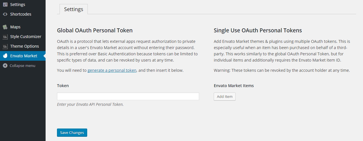
1. After activating the plugin, you will need to configure it by going to the "Envato Market" menu on your WP admin panel. You should see this screen:
2. There are 2 options to choose:
2.1) For Global OAuth Personal Token, it is suitable if this is your own website so once the token is saved, the plugin will list all the purchased items. To start creating the token, click the "generate a personal token" link on the page.
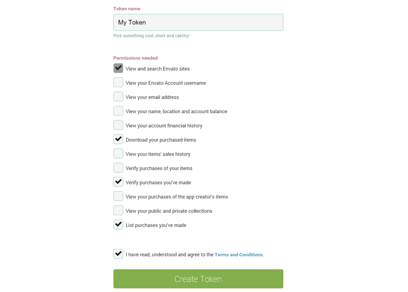
You might then see the login page. Just log in with your account that you used when purchasing the theme. Now you will see the screen like this for creating a new token:
Select the permissions as shown above and click "Create Token". You will finally see a screen showing the information of the created token. Copy that token and put it into the "Token" field on the Envato Market plugin page.
After saving, you will see all of the purchased items of the account that is used to create the token.
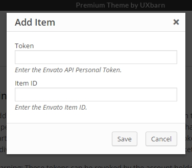
2.2) For Single Use OAuth Personal Token, it is suitable if you create this website for your client so you can specify which items you want them to display. The plugin will show only the added items. The overall concept is similar to the global token instructed above. Once you click the "Add Item" button, you will see this popup window:
Use the same steps as the above global token to create a new token. Or if you already have one, put it into the "Token" field here.
To find the item ID, just go to the item page on ThemeForest then look at the browser's URL field. You will see a number like this "11354296" right after the item name in the. Copy and put it into the "Item ID" field then click "Save".
That's it! If the plugin is properly configured, next time when there is a newer version of the theme available, you will see an update notification on your WP admin.
46. How to adjust the side margins of the side panel to make more room for the logo?
Please go to "Style Customizer > Others > Custom CSS" and use this custom CSS:
P.S. In case you would like to use custom CSS for other elements, I would recommend "Developer Tools" on Chrome or "Firebug" on Firefox to inspect the elements on the page. Then you can know which CSS selector to adjust.
47. Portfolio category images don't show up if Jetpack plugin is active. How to fix that?
Please go to "Jetpack > Settings > Appearance" and disable its Photon feature (screenshot: https://cl.ly/iljb ).
*NOTE: Below instruction is for the theme version prior to v2.0.0. If you are using the theme v2.0.0 and above, you can just upload the blog image (featured image) and it will be automatically scaled down to fit the area without hard cropping anymore. It means that the height of the image will now be flexible depending on the uploaded image's proportion.
Change from "height" to "min-height" for these two CSS selectors.
3. Re-upload all the image thumbnails for the blog posts (or you can use "Regenerate Thumbnails" plugin to regenerate them). This makes WordPress to recreate the image and use the adjusted size in step 1.
49. Style Customizer is not saving the changes. What should I do?
This issue is mostly caused by the server side or the WordPress installation. On the Style Customizer screen, after saving, if you check the Chrome browser's console in Developer Tools, you may see the error message like "403", "405" or "500 Internal Server Error" or some kind of AJAX stuff (or, in a very rare case, you may see nothing about the error).
I would suggest to firstly uninstall the current WordPress and theme then try the following steps:
3. Install the theme with all dummy data using steps provided in the theme's documentation.
4. Test the site again.
If the issue still persists, please try it on another servers you have or contact your web hosting and send them the error message you see in the Chrome's console. They should be able to help you out especially for the "500" error code.
Another possible reason is the PHP version on your server. Make sure that your server has the up-to-date PHP version installed.
50. How to activate capital letters for the intro titles and the menu?
In case you would like to use custom CSS for other elements, I would recommend Developer Tools on Chrome or Firebug on Firefox to inspect the elements on the page. Then you can know which CSS selector to adjust.
51. Icon fonts are not showing in Firefox. How to fix this?
It looks like it is about the cross-domain request issue.
For the fix, you might need to add some code into the ".htaccess" of your site to allow that request. See here for more info: http://davidwalsh.name/cdn-fonts
Or, if this issue happens on secondary language when you are using WPML plugin, please go to "WPML > Languages > Language URL format" and change the format to "Different languages in directories" instead. It should help.
52. How can I make portrait photos have the same width as landscape photos on portfolio single pages?
You would need to customize it via a child theme. Please do:
2. In the parent theme, open the "/includes/plugin-codes/custom-uxbarn-portfolio.php" file and find this function:
function enso_print_portfolio_image_format_content( $image_id_list_string ) {
   ...
}
3. Copy and put it into the "functions.php" file of the child theme you created in step 1.
4. After that, find this code in the function:
$image_size = 'enso-port-single-portrait';
Change it to:
$image_size = 'enso-full-width';
5. That's it. The theme should now display portrait photos in full-width.
53. Some bundled plugins cannot be updated. They tell me to register with their own license first. What to do?
There are two different cases here:
Case 1: The bundled plugins cannot be updated right after finished updating the theme
You find that the newer versions of the bundled plugins already come with the latest version of the theme. You normally can update them via WP but this time the plugins prevent you from the update.
Symptoms
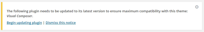
This is the case that after you finished updating the theme, you see a notification to update the bundled plugins on your WP like this:
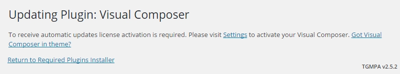
You then click "Begin updating plugin" and try to update the plugin in the next screen but you get the message like this:
Note that in this case, the bundled plugin is only Visual Composer. There can be any other bundled plugins that give the similar message, for example, Revolution Slider, LayerSlider, etc. and you cannot then update them via the theme.
Solution
On your WP panel, go to the "Plugins" menu and disable the plugins in question first. Then try to update them once again using the same method. This should let the update pass the registering/activating process of the plugin. Finally you should see a complete message like this:
Now just reactivate the plugin after the update.
Case 2: You just see a notification from the bundled plugins to register/activate them to receive auto update
In this case, you can just ignore the notification as you get the plugins with the theme (bundled ones). So you do not have the purchase code of the plugins to register or activate them. Normally the bundled plugins will be updated periodically with the new version of the theme.
Or, you may consider purchasing the plugins separately to get their own purchase code so you can use the auto update of the plugins without waiting the next version of the theme. But we cannot guarantee the plugin support as we only test with the version that comes with the theme.
54. [v1.2.0 Note] Changes in theme's custom code for Visual Composer
Since the theme v1.2.0, most custom code for overriding Visual Composer's elements are deprecated. A little drawback is that it might affect some of previous elements that you are using in your theme. But it will be greater in a long run for supporting plugin's stability and its powerful features.
Some affected elements are:
Button
Previous one is deprecated.
Any icon that you were putting in the old button will not display.
Button shape (square, radius, and round) will not display correctly as it might only display as square shape.
Solution: Remove the old one and instead use the new Button element from the list.
Single Image
"on click" attribute of the element will be reset.
Solution: Edit the element and select the attribute again.
Image Gallery
Caption will not display.
You might need to respecify image size.
Note: You can use "circle" extra class name for making the gallery grid displaying as circular shape.
Call-to-action Box
Previous one is deprecated. You can use a newer element from the list.
Text in the old box might disappear.
Solution: Remove the old one and instead use the new CTA element from the list.
You can enter either "bottom-line", "right-line", "left-line" or "top-line" into the extra class name field of the newer element to display the accent-color line on the box.
Progress Bar
Some bar colors might be missing which you can respecify.
Tabs
Previous one is deprecated. You can use a newer element from the list.
Tour
Previous one is deprecated. You can use a newer element from the list.
Message Box
You might have to reselect the color for the box.
Accordion & Toggle
Previous one is deprecated. You can use a newer element from the list.
You might have to respecify the active tab and collapsible attribute.
55. I want to have all the content like the demo site. How do I do that?
You can do that by importing the demo data from the provided XML file which is included in the full purchased package.
For a full guide of how to install the theme (and import the demo data), we would suggest reading through the theme documentation. There are also some useful tutorials provided in the doc to help you get started with the theme.
Note that the documentation is also included right in the purchased package. Just go to the 'Documentation' folder and open the 'index.html' file with your browser.
56. I cannot open portfolio single page. I only see "404 Page Not Found". What to do?
Please go to "Settings > Permalinks" and click to save once. This should solve the issue.
57. How to customize the width of the scrollbar of the content area?
You would need to manually edit the JS code for that. Please open "/js/kose.js" file and find this code:
Just increase the value of "cursorwidth" here to make the scrollbar bigger. Then clear all the the cache and see the result.
Note that the theme uses "nicescroll JS" for the scrollbar. You can find more info about its API here: http://areaaperta.com/nicescroll/
58. [v1.7.0 Note] For WooCommerce user, there are a few extra steps when updating the theme to v1.7.0 and above
The theme v1.7.0 has removed some WooCommerce's template files which were previously in "/woocommerce" folder inside the theme folder. So, in order to make it work properly with WooCommerce 2.3, before updating the theme files, please do:
1. Connect to your FTP and go to the theme directory of your site. The path should look like this:
[root]/wp-content/themes/Fineliner
2. Delete "/woocommerce" folder that is inside the theme directory.
That's it. Now you can update the theme as normal by uploading the latest theme files into this directory, replacing any existing ones (don't forget to back up first).
59. How to hide the full screen slider and make the content area displayed right under the menu on mobile views?
You can use this custom CSS to adjust it:
@media only screen and (max-width: 1160px) {
    #full-scrn-slider-container {
        display: none;
    }
    #content-container {
        top: 0;
        position: relative;
    }
}
You can find where to place the code by going to "Style Customizer > Others > Custom CSS".